“PowerPoint” Reaction

I admit that I am a fan of Microsoft PowerPoint. Anytime I have to do a presentation in any of my classes, I immediately fall back on the option of constructing a PowerPoint. They’re clean, organized, and easy to make. What’s not to love?

PowerPoint presentations have been used by my teachers in instruction since I was in middle school. They are the standard method used for teaching. There are extremes to how a PowerPoint should be arranged, and a happy medium should be reached if one expects to deliver a successful presentation. I agree with Tufte in the sense that the audience should be respected and that the presentation should cater to the audience.

For example, PowerPoints should not be too vague. The whole purpose of the PowerPoint is to aid in the instruction of the content. The Gettysburg PowerPoint, for example, was incredibly too vague. There weren’t any coherent thoughts or even full phrases, let alone full sentences. On the other hand, a PowerPoint shouldn’t be so stuffed with information that it is all text. So, a PowerPoint should be short but sweet. There should be enough information that a speaker can use it for notes during the oration. I think that only main ideas and points should be listed, with basic depth. It’s used as a tool for speakers, so the sole focus shouldn’t be on the PowerPoint anyway.

As for the presentation itself, I think it should look clean. A PowerPoint presentation that has random noises and crazy effects to indicate slide changes are over the top. That was cool in elementary school, but after that it’s just too unprofessional. They distract from the actual presentation. However, a PowerPoint presentation shouldn’t be bland or boring. This is especially the case if the speaker is boring or quiet. No one wants to read a black and white PowerPoint, but no one wants to see a multicolored, patterned background either. A basic theme with one or two colors is preferable whenever I make or read PowerPoints. It does its job as the visual aid for the speaker, but can still hold the attention of the audience.

Overall, I like PowerPoint. I will continue to use PowerPoint for presentations because they are effective when constructed properly.

“Feltron Report” Reaction

The Feltron Reports are a collection of seemingly haphazard statistics and recollections from the days of Nicholas Felton’s life. The reports are eye-catching and clean in presentation. It’s evident that Felton is a graphic designer, with his intricate and appealing info-graphics.

Although I am a fan of the layout and look of the reports as a whole, the purpose of most of the reports seems unclear. His annual reports that detail his eating and drinking habits, his taste in music, where he went to eat, etc. are interesting but also leave me wondering, “So what?” It’s as if he took his written diary, translated everything into numbers, then played around in Adobe InDesign. I was almost expecting him to detail how many times he pooped in a year.

Some of the reports are actually informative, such as “Hello China.” The report is mainly composed of photographs from his visits. This is an interesting take on a photo essay, and he did a good job with it. Still, the report provides little to no actual information about the places he went or the things he did. Nonetheless, the focus seems to be more substantial than former reports. This could be because the focus of the report is something other than his own personal life.

I think the reports are cool and fun to look at. However, I think it’s creepy that I know that he consumed approximately 83,565 milligrams of caffeine in 2007 or that the last photograph he took in 2008 was of the Golden Gate Bridge. This is his own personal information; it’s like I just read five of his diaries.

All in all, I like the reports. I think they should be used for private use or as a hip personal diary. For example, I’d like to “Feltronize” my own life because the final product would look amazing. But to go so far as to publish it is a little too much.

Map Overlay

Overlaying a map on top of a section of Google Earth was pretty fun. Honestly, I think the hardest part of this assignment was finding a decent picture to overlay with. The rest of the assignment was rather straight-forward.

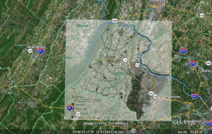
I chose to focus on Loudoun County, which is the county I have lived in my whole life. I found a pretty basic illustration of the county online and decided to use it. After opening Google Earth, I flew to Loudoun County and placed the map I found on top of the Google Earth image. Scaling and arranging the two layers was not as difficult as I had imagined and only took a matter of a few minutes. It was helpful to look at natural features, such as the Potomac River. I also had a boundary layer on in Google Earth, which made matching county lines fast and easy.

One cool thing about overlaying an image onto another map is the ability to view the differences in the two images. I liked playing with the transparency in order to see what changes occurred. I think this is critical to historians who want to show change over time or development of a certain area. I found it especially interesting to see differences in roads and towns.

Anyway, here is a picture of what my final result came to be:

“The Differences Slavery Made” Reaction

I found this article to be incredibly interesting! I like the presentation of the article. It is fairly easy to follow and the points are presented in a clear and understandable fashion. There is logical flow and consistency to the subject matter, and the use of graphs, charts, and maps to support the claims works to their advantage. There is an info-graphic attached to the end of nearly every paragraph in the article, and this supplemental evidence helps to clarify, verify, and simplify their argument.

One thing I really enjoyed about the article was the great amount of research and data that went into the study. There is a wealth of information in that article. I found the points of analysis section to be especially riveting. You can choose from several different topics to directly compare the two counties. Upon selecting a topic, information is presented in a clear and organized manner. There are extensions to more information from these pages, which leads to even more information. I could tell there was a lot of time and strict research behind this project.

Another part of the site that I enjoyed was the methods section. This section detailed the process of collecting and digitizing the data used in the argument. I found this interesting because it shows how vital this process is to historians. Additionally, I just like to look at all the behind the scenes activity.

I never realized the full potential of digitizing history until reading this article. It’s amazing how much history can be discovered with the act of digitization. So much more can be uncovered today than before with the use of innovative technology, such as multiple layers on a historical map. Here’s a quote from the conclusion of the article that I really like:

By encouraging us to recast our arguments into new forms, digital history may lead us to revisit some old questions in new ways, as we have done in this article. As historians grow more fluent in its use, the digital environment may offer bold new ways of understanding the vast record of the human past.

Mapping and Charting

Making a map was not as difficult as I thought it would be. Google Maps does a great job at giving step-by-step instructions on creating a map. Some parts were tricky, such as creating a new road direction. However, after a few minutes I got the hang of it.

I made a map of the route I take to come to school from my house. The total distance is about 50 miles, and I provided six steps to making the trip. Here’s my map:


View Kamna’s Map in a larger map

For the chart, I just messed around and played with the site. I simply used random data points and random tags for each axis. Maybe I’ll conduct some research on a subject and create a chart with meaningful data. For now, I’m just testing the waters. I used the dimensions suggested by Professor Cohen (480×320). I really enjoyed being able to see both the text coding representation of the graph and the image of the graph itself. The live updates were useful in showing me what I was doing to the chart. Here’s what it looks like:

Amount of time spent on Tumblr

The y axis represents time in minutes. Each of the sets at the bottom represent the day of the week.

“Hacking” Reaction

Mat Honan’s account of how he lost his digital life to two hackers was an intriguing read. The article was written in a friendly fashion and was enjoyable to read. I was surprised to see how far some hackers went just to get someone’s Twitter handle. This is funny to me as I personally know someone who desperately wants another person’s Twitter handle; but going so far as to hack and destroy someone’s accounts for it seems a little too far.

I personally use Apple products. I’m writing this from my MacBook Pro right now. I am very involved on the Internet and I have multiple emails and accounts. It’s safe to say that I am just as vulnerable as Honan was. In that sense, the article was a good lesson to me about the vulnerability of the digital age. I liked how Honan outlined exactly what happened and discussed what he did wrong. At the end of the article, he described what he should have done. This was a very useful section in the article because I try to follow those methods to stay safe and secure with my identity.

I was surprised to see how easily Apple gives information away to others and how easy it is to get into an account. It seems like Apple is not the only one who does that, though. I feel like it would be relatively easy to call into any tech support and get information, as long as you provide the basic requirements to gain access. The digital age brings a new haziness to identity, and there are a number of human flaws that can also play into it. For example, pulling up the wrong account.

Safety is a vital issue and I think stories like Honan’s are influential in updating and fixing account security. I think it is ultimately up to the user to be as secure as possible. Hackers may be bad, but in committing these ethical crimes they force companies to build a tighter security network.

I’m not exactly sure how “secure” I am with all of my technology. I used a variation of a similar phrase for most of my passwords, which is pretty bad. However, for things that are more personal, I use a completely different password. I don’t disclose private information with anyone and I don’t autofill all of my accounts, so that keeps others from gaining access to my information. I keep a lock on my laptop so that only I can access its contents. Nonetheless, I feel like I could be a much smarter and more safe digital user. I know that there is room for improvement.

“Archive” Reaction

I decided to browse the Archive Team website for this assignment. Upon first glance, I thought this site looked rather unprofessional. The layout of the page resembles that of Wikipedia, so I subconsciously linked the two sites together. I think the typically negative stigma of Wikipedia, and the accidental link of that site to archiveteam.org, lessened the credibility of this site. However, the fact that Archive Team is a .org site gave it a little more credibility. Another thing that I found unprofessional about the site was the image that is posted on their front page. In a memelike image it says “WE ARE GOING TO RESCUE YOUR SHIT.” That’s a great intention, but the diction detracts from that. Also, the language throughout the site is pretty informal.

Aside from all of that superficial stuff on the surface of the front page, I think the site is actually pretty useful. I like the intentions and philosophy of the site. I like how easy it is to get involved, but there are no anonymous edits so everyone has to have some verification. I also like the fact that they monitor sites that are important, just in case something was to happen to them. One of these sites is Internet Archive, which is the home for one of the other options for this assignment. They also watch sites that are on decline, which seems useful for when these sites do go down.

Some of the sites are related to education and more “important” topics. Others, however, related to fandom and more “insignificant” topics. Regardless, preserving these sites are important for the future.

As for the legality of the site, I think they are safe. They back up pages of sites and wait until the site gets taken down before the put up their stored replica. If there was an issue, I feel like the primary man who runs the site (Jason Scott) would take the heat for it because he states “This means it’s my fault” under his name.

“Sampling” Reaction

I thought the video about the Amen Break was incredibly fascinating. The first time the loop was played, I immediately recognized it from other songs. I have heard that loop dozens of times in drum and bass and hip hop tracks, but I didn’t know its origin until I saw the video. I distinctly remember it in the theme song of one of my favorite childhood shows, The PowerPuff Girls. Here‘s a link to the theme song. See if you can recognize the Amen Break.

Although the video was very interesting, the narrator was extremely dry. His monotone narration bored me to an extent, but the content was still intriguing enough to keep my attention. I thought the first half of the video was more interesting than the later half, especially the comparisons between the Amen Break and samples of its use in contemporary tracks. One quote that I liked was:

“I find this quite interesting: hundreds of tracks, dozens of DJs, a number of clubs and events, in effect, an entire subculture, based on this one drum loop.”

There is a lot of controversy on the topic of sampling. Some say sampling and mixing is lazy songwriting and is therefore unoriginal because the artist is just taking beats and pieces from other tracks. On the other hand, the artist who uses samples from other tracks is creating a new masterpiece in itself. This very process, however, has always fascinated me as a fan of electronic dance music. The entire genre is composed using samples and then building upon them to make a new, original track. So then how can we block the usage of samples when all it does is foster, inspire, and create new tracks? To stop this would be to stop progress. I enjoyed Alex Kozinski’s quote on this matter:

“Culture is impossible without a rich public domain. Nothing today, like nothing since we tamed fire, is genuinely new. Culture, like science and technology, grows by accretion, each creator building on the works of those who came before. Overprotection stifles the very creative forces it’s supposed to nurture.”

The documentary brought up a thought-provoking analogy between photography and painting to an original track and a sampled track. A photograph, much like a sampled track, simply captures what is already visible (or audible) whereas a painting, like the original track, is the product of hours and hours of laborious creative output. Does that make photography lazy or unoriginal? Does that make this entire culture that is based upon sampled music lazy or unoriginal?

As for copyright laws, I think that as long as an artist gives credit where it’s due then there should be no issue. When content, such as a sample, is used as a building block for a new work it should not be considered copyright infringement. In the documentary, it mentioned that the original artist doesn’t even get money from the lawsuits or sample fees when a new artist uses their work; the label gets all of the money. The artist clearly deserves any money that would result from such a case. But, since that’s not the case, I think the artist deserves at the very least proper credit.

A perfect demonstration of this is the case of Clyde Stubblefield. Stubblefield’s drum beats are widely spread into other tracks and genres without his consent. However, he could care less. His easy-going and understanding attitude is admirable because he understands that music is ever-changing, just like everything else, and needs some foundation for further progress.

“Heavy Metal Umlaut” Video Reaction

The video about the “heavy metal umlaut” was fascinating to me. There were quite a few things that surprised me while viewing the video. First of all, I had no idea that there was a Wikipedia article solely dedicated to the usage of umlauts in heavy metal bands; it’s such a unique topic! The next surprise occurred when I saw how full the page seemed to be with information. Regardless of whether or not the content is reliable, it’s still astounding to see how much information is poured onto the site.

Obviously, the progression of the Wikipedia page is really interesting to watch. I really enjoyed seeing the process from a short stub of an article into a fuller, richer article that was professionally divided and organized. More specifically, I liked the way the video focussed on a few little themes and traced their progress chronologically. It was interesting to see the development of minuscule subcategories of the article. Another thing that I found interesting was the professionalism the surrounded the article. The fact that an article about the use of umlauts in the names of heavy metal bands was constantly being edited and updated surprised me. Especially the fact that there was a 5 minutes series of vandalism and cleaning up.

I think this goes to say a lot about Wikipedia. I know there is a negative stigma about using Wikipedia because it isn’t a great source for research. However, it is a good starting point in research, seeing as they’ve expanded their references page to include worthy sources and have a relatively new sense of professionalism to their aura.

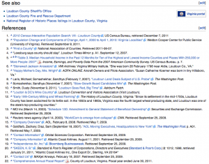
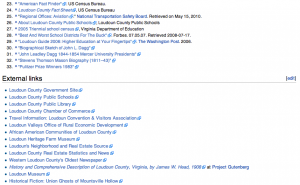
I’m interested to look back on the history of other weird Wikipedia pages now. I just looked up Loudoun County, Virginia. This is the county that I’ve lived in my whole life. The references for the page are numerous. Here’s a screen shot of the references:

The history of the article is interesting to watch. It seems to have been constantly updated since 2002. The last update, for example, was on the 9th of this month. I like the fact that the article is “live” and still being watched and edited.

When the article was brand new, it was very bland. It only listed very basic statistics, such as geography and demographics. The content and information was only from the year 2000. In terms of organization, the article was loosely arranged and lacked a table of contents.

Today, the article is full and professional looking. I would use this page as a basis or starting point for information or research. However, I would link out to the extensions and references of the page to get more reliable and trustworthy information.

Scavenger Hunt

1) An op-ed on a labor dispute involving public school teachers from before 1970
To do this, I went to ProQuest’s Historical Newspapers section. I searched “labor dispute school teacher 1960-1969” and only got one result: this. But I didn’t think that seemed right.
Next I searched “labor dispute public school teacher” and then sorted the search using the ProQuest tools on the side by including only “article,” “letter to the editor,” and “editorial.” Then I selected the publication date to be between 1960 and 1969. I still ended up with 521 results.
Frustrated, I searched “”labor dispute” AND “public school teachers”” and applied the same time stipulations. This left me with 4 results. Two of these were straight news (not op-ed articles) and another was about a garbage strike. This article was the closest thing I could find.
I wanted to try another search, but then ProQuest had some problems. Moving on.

2) The first documented use of solar power in the United States
I searched “”solar power” AND “united states”” in ProQuest (after it got fixed somehow). Then I sorted it to only show articles and other. I ordered it to show the oldest articles first and ended up with this.

3) The best resource for the history of California ballot initiatives, including voting data
I don’t even know what this means. Anyway, I went to JSTOR and searched “california “ballot initiatives” AND “voting data”.” I got 19 results, which is not bad. I thought this article was pretty good.

Although this assignment wasn’t incredibly difficult, it was frustrating. It’s hard to narrow searches on such obscure topics! I spent a good hour and a half trying to find these items, and I don’t even think I found the “right” stuff. This did, however, teach me some really important things about search engines, narrowing searches, key words and phrases in searching, and patience while trying to find something so specific.
I’m excited for class tomorrow so I can see what everyone else found!