“Feltron Report” Reaction

The Feltron Reports are a collection of seemingly haphazard statistics and recollections from the days of Nicholas Felton’s life. The reports are eye-catching and clean in presentation. It’s evident that Felton is a graphic designer, with his intricate and appealing info-graphics.

Although I am a fan of the layout and look of the reports as a whole, the purpose of most of the reports seems unclear. His annual reports that detail his eating and drinking habits, his taste in music, where he went to eat, etc. are interesting but also leave me wondering, “So what?” It’s as if he took his written diary, translated everything into numbers, then played around in Adobe InDesign. I was almost expecting him to detail how many times he pooped in a year.

Some of the reports are actually informative, such as “Hello China.” The report is mainly composed of photographs from his visits. This is an interesting take on a photo essay, and he did a good job with it. Still, the report provides little to no actual information about the places he went or the things he did. Nonetheless, the focus seems to be more substantial than former reports. This could be because the focus of the report is something other than his own personal life.

I think the reports are cool and fun to look at. However, I think it’s creepy that I know that he consumed approximately 83,565 milligrams of caffeine in 2007 or that the last photograph he took in 2008 was of the Golden Gate Bridge. This is his own personal information; it’s like I just read five of his diaries.

All in all, I like the reports. I think they should be used for private use or as a hip personal diary. For example, I’d like to “Feltronize” my own life because the final product would look amazing. But to go so far as to publish it is a little too much.

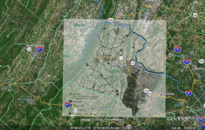
Map Overlay

Overlaying a map on top of a section of Google Earth was pretty fun. Honestly, I think the hardest part of this assignment was finding a decent picture to overlay with. The rest of the assignment was rather straight-forward.

I chose to focus on Loudoun County, which is the county I have lived in my whole life. I found a pretty basic illustration of the county online and decided to use it. After opening Google Earth, I flew to Loudoun County and placed the map I found on top of the Google Earth image. Scaling and arranging the two layers was not as difficult as I had imagined and only took a matter of a few minutes. It was helpful to look at natural features, such as the Potomac River. I also had a boundary layer on in Google Earth, which made matching county lines fast and easy.

One cool thing about overlaying an image onto another map is the ability to view the differences in the two images. I liked playing with the transparency in order to see what changes occurred. I think this is critical to historians who want to show change over time or development of a certain area. I found it especially interesting to see differences in roads and towns.

Anyway, here is a picture of what my final result came to be:

“The Differences Slavery Made” Reaction

I found this article to be incredibly interesting! I like the presentation of the article. It is fairly easy to follow and the points are presented in a clear and understandable fashion. There is logical flow and consistency to the subject matter, and the use of graphs, charts, and maps to support the claims works to their advantage. There is an info-graphic attached to the end of nearly every paragraph in the article, and this supplemental evidence helps to clarify, verify, and simplify their argument.

One thing I really enjoyed about the article was the great amount of research and data that went into the study. There is a wealth of information in that article. I found the points of analysis section to be especially riveting. You can choose from several different topics to directly compare the two counties. Upon selecting a topic, information is presented in a clear and organized manner. There are extensions to more information from these pages, which leads to even more information. I could tell there was a lot of time and strict research behind this project.

Another part of the site that I enjoyed was the methods section. This section detailed the process of collecting and digitizing the data used in the argument. I found this interesting because it shows how vital this process is to historians. Additionally, I just like to look at all the behind the scenes activity.

I never realized the full potential of digitizing history until reading this article. It’s amazing how much history can be discovered with the act of digitization. So much more can be uncovered today than before with the use of innovative technology, such as multiple layers on a historical map. Here’s a quote from the conclusion of the article that I really like:

By encouraging us to recast our arguments into new forms, digital history may lead us to revisit some old questions in new ways, as we have done in this article. As historians grow more fluent in its use, the digital environment may offer bold new ways of understanding the vast record of the human past.

Mapping and Charting

Making a map was not as difficult as I thought it would be. Google Maps does a great job at giving step-by-step instructions on creating a map. Some parts were tricky, such as creating a new road direction. However, after a few minutes I got the hang of it.

I made a map of the route I take to come to school from my house. The total distance is about 50 miles, and I provided six steps to making the trip. Here’s my map:


View Kamna’s Map in a larger map

For the chart, I just messed around and played with the site. I simply used random data points and random tags for each axis. Maybe I’ll conduct some research on a subject and create a chart with meaningful data. For now, I’m just testing the waters. I used the dimensions suggested by Professor Cohen (480×320). I really enjoyed being able to see both the text coding representation of the graph and the image of the graph itself. The live updates were useful in showing me what I was doing to the chart. Here’s what it looks like:

Amount of time spent on Tumblr

The y axis represents time in minutes. Each of the sets at the bottom represent the day of the week.